Monday, 30 April 2012
Thursday, 19 April 2012
EVALUATION ACTIVITY 7
Looking back at your preliminary task (the continuity editing task), what do you feel you have learnt in the progression from it to full product?

shot/ reverse shot is a techneak that gives a really proffeshional effect to the audence with little effort to film which we found out while filming our preliminary task and as a group we all liked the way it added suspense and kept the a otherwise boring part of the film interesting so it was a natural choice for a camera shot for our final project. editing the two pices of footage together was one of the hardest when it came to edditing and so took alot of time in the preliminary task and as we were on a limited time scale we had to waigh up if it was worth the time and so we decided that it would be worth some time getting it right then having a stright forward shot. shot reverse shot works well in all types of cinematic media when a conversation is taking place because as the characters are shown facing opposite directions the audience assumes they are looking at each other . comparing the two shots it is easy to see how we have improved our filming techneak in many ways examples being; camera is more steady, script flows more, less pours in between the cuts.

match on action has been used in two different ways in the final and the preliminary task, for the preliminary we used match on action to show our actors moment thought the door to add realism to the project as they was no atmosphere we where aiming to create comparing this to our final task where we use match on action to add emphasis on her knocking on the door shows the audience that this is a critical part in the film. This is different from the stereotypical use of match on action where in is only used for transitioning between locations but as we found the preliminary task match on action relatively simple we decided to challenge ourselves and try something more complex and i feel this worked really well overall to gain the effect needed. when we first attempted match on action in the preliminary task we only took 2 takes of the scene and assumed in would be okay but when we started to edit we realized that there were continuity issues`s in the shot that could not be re-filmed and so when we started on the filming for our final task we took multiple takes of every scene allowing us to have more freedom to pic the best one and not have to work with one that is not quite perfect.

in our preliminary task there was no use of angles and i feel this could of been experimented a bit more with to gain the experience needed for a successful final project so we decided to use both high and low angels. the low angel shown in the second picture was used to differentiated between a location in the house that we have used twice before in a very short time (female character opening the door and killer moving up the stairs) but also puts the audience where they would feel most emotive towards the victim as the audience would want to shout at her not to go up the stairs. looking at the preliminary task we have used very simple movements and camera angels which i feel makes it look very plane and would not fit for our horror genre where typically the camera changes angle to create different effects at any given moment, we have tried to re-create this effect on a smaller scale as to not give a jumpy effect that could be crated when working within a 2 minute time scale.
Tuesday, 17 April 2012
EVALUATION ACTIVITY 6
What have you learnt about technologies from the process of constructing this product?
what you learnt about it/from using it.

The first picture (top left) is of the camera we used to film the project it is a Panasonic HM-TA1 different from the one our school provided us with, we started off filming with the schools one but because we were mainly using artificial light the end product was yellowish whereas the one shown seemed to handle the light better and looked more realistic when it came to the editing. from this i have learnt that before we shoot our film we should do a test shot to see how it comes out on the computer that way we don't waste time having to re-shoot scene where the lightning isn't good. the camera its self was really easy to use, it is my camera so i have used it before which helps use the camera to our advatege and means we did not lose time trying to work the camera.
The next picture along (clockwise) is the logo of adobe Photo shop. we used photo shop more than we expected to but with the pictures in the opening 25 seconding needing edditing e.g redtint we ended relyling on it to creat the final effect. when i first started useing Photo shop i had never used it before and so i found it hard to work but thankfully two members in my group Lauren and Beth use it in another subject and were able to teach be the basics and at with a couple of pratics runs i managed to get the effect i wanted. i now know how to use photoshop with the help of my group but if i was working on my own i would of found it impossible to do and so i am now going thought diffrent programs to ensure i know how to work them
Youtube- we found youtube a very easy to use as all members of our group use it normaly and so know time was waisted trying to work it. anothere advantage of youtube was that all members of the group could acess the material that we wanted to upload on to our blog, which was easy as blogger has a partership with youtube. what i learnt form youtube is that it is possible to annotate the footage with a prevously has no knowlage of .
Adobe Premeria elemets, PR symbol, was what i found the hardest to use for a number of reasons firstly because none of the group has ever used it before so we were mostly working on a trail are error bases, learning from what went really wrong and made sure we didn't do it again. from this bit of equipment i learnt the importance of saving work every time we make a change to our opening due to it crashing because of the files size we were working with.
The tripod was one the easier thing to pick up, possibly because they was nothing to go drastically wrong with it, picking up how to use the tripod also worked of a trial and error bases but was very easy to work out the best and fastest way of getting the tripod ready for the next shot. the tripod worked of a series of retractable feet allowing you to adjust the height also another way to add height was by a the head of the tripod making it drastically higher, areal shot.
Blogger, was like most pieces of technology in this course was hard when learning how it works but easy once you get the hang of it. i have found blogger very easy to use and a grate way of showing my creative side, once i manage to get the pictures where i want them to go which was hard at times. i have learnt form this technology that i can be creative with what i do and not simply display the information in one set format.
what you learnt about it/from using it.

 |
| annotated camera, sorry it had to be big so you could read the writing |
The first picture (top left) is of the camera we used to film the project it is a Panasonic HM-TA1 different from the one our school provided us with, we started off filming with the schools one but because we were mainly using artificial light the end product was yellowish whereas the one shown seemed to handle the light better and looked more realistic when it came to the editing. from this i have learnt that before we shoot our film we should do a test shot to see how it comes out on the computer that way we don't waste time having to re-shoot scene where the lightning isn't good. the camera its self was really easy to use, it is my camera so i have used it before which helps use the camera to our advatege and means we did not lose time trying to work the camera.
The next picture along (clockwise) is the logo of adobe Photo shop. we used photo shop more than we expected to but with the pictures in the opening 25 seconding needing edditing e.g redtint we ended relyling on it to creat the final effect. when i first started useing Photo shop i had never used it before and so i found it hard to work but thankfully two members in my group Lauren and Beth use it in another subject and were able to teach be the basics and at with a couple of pratics runs i managed to get the effect i wanted. i now know how to use photoshop with the help of my group but if i was working on my own i would of found it impossible to do and so i am now going thought diffrent programs to ensure i know how to work them
Youtube- we found youtube a very easy to use as all members of our group use it normaly and so know time was waisted trying to work it. anothere advantage of youtube was that all members of the group could acess the material that we wanted to upload on to our blog, which was easy as blogger has a partership with youtube. what i learnt form youtube is that it is possible to annotate the footage with a prevously has no knowlage of .
Adobe Premeria elemets, PR symbol, was what i found the hardest to use for a number of reasons firstly because none of the group has ever used it before so we were mostly working on a trail are error bases, learning from what went really wrong and made sure we didn't do it again. from this bit of equipment i learnt the importance of saving work every time we make a change to our opening due to it crashing because of the files size we were working with.
The tripod was one the easier thing to pick up, possibly because they was nothing to go drastically wrong with it, picking up how to use the tripod also worked of a trial and error bases but was very easy to work out the best and fastest way of getting the tripod ready for the next shot. the tripod worked of a series of retractable feet allowing you to adjust the height also another way to add height was by a the head of the tripod making it drastically higher, areal shot.
Blogger, was like most pieces of technology in this course was hard when learning how it works but easy once you get the hang of it. i have found blogger very easy to use and a grate way of showing my creative side, once i manage to get the pictures where i want them to go which was hard at times. i have learnt form this technology that i can be creative with what i do and not simply display the information in one set format.
Thursday, 29 March 2012
EVALUATION ACTIVITY 4
Who would be the audience for your media product?
ideally we would like our film to appeal to everyone, but that has never happened in the film industry and i feel with regret that our film is no exception. there are always going to be people that react negatively to a type of genre but horror I feel has the opportunity to entice a wide range of people who are interested in different things and genre's.
ideally we would like our film to appeal to everyone, but that has never happened in the film industry and i feel with regret that our film is no exception. there are always going to be people that react negatively to a type of genre but horror I feel has the opportunity to entice a wide range of people who are interested in different things and genre's.
 |
| typical male |
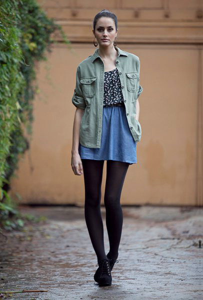
This picture is of the typical audience for our horror film aged between the age of 16 to 25. With horror films it is hard to spefisefy where they shop, music they listen to and favourite t.v programs as part of the beauty of a horror film is that it can move thought the dives of social groups. But with our horror movie taking a more thriller than gore approach we can vaguely circle that our male typical audience would be. for example they would be interested in TV shows like Showtimes` "DEXTER" which follows the life of a serial killer our film takes a darker approach to this but I still feel it can work quite well they would also like the saw films which in some aspects fallow the life of the jigsaw killer. due to as prevously stated the complications which come with defining an audence by the music they listen to is extreamly hard to do by genre but i feel they would listen to new mucis to fit in with our age demographic as you would sterotypicaly assosciate horror films with a younger gerneration who would listen to more recent music whereas if a horror film would appeal to an older audiece they would sterotyplicaly listen to slightly older music e.g the smiths.

our typical viewer would shop in high street chains like topshop and river island these two brands of shops are very popular among people aged 16-25 and is considered the place to get reasonable priced high street fashion. study's have shown that even with the proliferation of DVDs and blueray going to the cinema is still as popular thing to do as the weekends with a group of friends and our film hopefully will bring in group audiences.

our typical viewer would shop in high street chains like topshop and river island these two brands of shops are very popular among people aged 16-25 and is considered the place to get reasonable priced high street fashion. study's have shown that even with the proliferation of DVDs and blueray going to the cinema is still as popular thing to do as the weekends with a group of friends and our film hopefully will bring in group audiences.
EVALUATION ACTIVITY 1
In what ways does your media product use, develop or challenge forms and conventions of real media products?
 1. this is one of the first of a sequence of pictures edited on Photoshop to give the red effect. This set up the back ground to the film and the villain and letting the viewer know that he has killed before, the connotations of red are danger and blood which in enforced by the loud music changing the tone of the film and convincing the audience that the film is of the horror genre.
 2. This moment in the film introduces the 2 girls, tara and an unknown girl. We have not given her a name as our film will not follow them further than the 2 minutes, giving names to people who will shortly die just gives the audience some information that they will not need, this is commonly used in films to allow the attention to be directed at the maincharacter. Instead our film will follow the story of the killer and his inevitable downfall with different cast members which are directly challenging the conventions of a horror film where the script focuses of the victim. The camera shot we have used on this meeting scene is an over the shoulder shot I feel this works well as it gives the viewer a scene of exclusion, they are not allowed to see the inside of the house but also gives the sense that someone is watching them very common in the horror genre and will be developed further into the clip.
3. This moment in the clip is very common in the horror genre and has been used in classic’s like the ring this works well in our opening two minutes as it takes the audience back to their routes of the horror genre and in doing this we make sure that we don’t alienate our typical viewer. This clip also shows the costume they are wearing as something very typical of a laid back teenaged girl style making the viewer identify with the two girls more by using this convention it helps develop feelings toward the two girls and makes the effect of them dying in an unknown way more effective.
 4. this shot in some ways can be considered to be Could be seen as using the tradition horror convention in the use of the setting, a girl alone venturing outside on her own in search of a strange sound but we have tried to develop this concept with the use of camera work. By having “Tara” move out of the shot the traditional thing to do would be to cut or pan to follow the movements but instead we have hidden the villain which makes his first movement very effective as the audience would not be expecting it. The setting for this scene is a darker version of the establishing shot adding to the atmosphere of the shot as the viewer has something to compare the shot to, was bright and nonthreatening now gray and suddenly more intimidating.
 5. for me personally this is one of the most critical camera shots in the opening of our film the reason for this is that it directly challenges the stereotypical conventions of a horror genre by way of taking a different perspective of a commonly used moment in horror films (catching a glimpse of the villain in the window but is unsure of what you saw) this new technique we have used also emphasises the fact that the victims are not the main focus of the film and will shortly die inset it is the killers proses we are focusing on. The props on the windowsill use another convention of the horror genre to show how the setting is very stereotypical of the 15-23 generation allowing people to relate more to the characters.
 6.
6.  this shot is a close- up of our killer moving up the stairs we used match-on-action to very this shot as it could be seen as quite boring and slow paced whereas a typical convention of a horror film is lots of tension build up, our use of the close up and match-on-action allows us to develop this convention as it allows the viewer to really notice the significance of him walking up the stairs to wait for his victim to follow.
7. this is a very stereotypical moment in our film it is commonly use in the horror genre, the victim walks straight into the killer. by using this convention is creates the suspense needed to make our film a true horror film by the way of knowing that she is going to die if she goes up there but something stops her at the last moment, this sadly does not happen as the point of this opening is to introduce you to this unknown killers methods.
 8.by using the contrasting colours of light among the dark you can clearly she the hand of the last victim on the window before she fades away, this hand print of the window becomes the signature of our killer that will be repeated throughout the film. by use of a primitive version of the special effects used in other horror films you can just about make out the imprint of the hand on the window the use of fake blood our film uses the convention off blood and gore associated with the horror genre to allow the audience to be aware that this is going to be a part of the film as we have a not shown any deaths in detail.
9. this is the part in our film where the title is shown, normally in a horror film the title is shown near the start in simple font with white writing the style we have chosen fits more into a convention of an action film where there is a big fight/chase scene before the title sequence. We have opted for a bold strong font to reflect the killers persona the red tint in the white title stands out against the black background, this coupled with the solute of the killer walking away singles the start of our film. the red in our title connotes the blood of our horror film reaffirming the fact that this film is of the horror genre.


3. This moment in the clip is very common in the horror genre and has been used in classic’s like the ring this works well in our opening two minutes as it takes the audience back to their routes of the horror genre and in doing this we make sure that we don’t alienate our typical viewer. This clip also shows the costume they are wearing as something very typical of a laid back teenaged girl style making the viewer identify with the two girls more by using this convention it helps develop feelings toward the two girls and makes the effect of them dying in an unknown way more effective.


 this shot is a close- up of our killer moving up the stairs we used match-on-action to very this shot as it could be seen as quite boring and slow paced whereas a typical convention of a horror film is lots of tension build up, our use of the close up and match-on-action allows us to develop this convention as it allows the viewer to really notice the significance of him walking up the stairs to wait for his victim to follow.
 7. this is a very stereotypical moment in our film it is commonly use in the horror genre, the victim walks straight into the killer. by using this convention is creates the suspense needed to make our film a true horror film by the way of knowing that she is going to die if she goes up there but something stops her at the last moment, this sadly does not happen as the point of this opening is to introduce you to this unknown killers methods.
 8.by using the contrasting colours of light among the dark you can clearly she the hand of the last victim on the window before she fades away, this hand print of the window becomes the signature of our killer that will be repeated throughout the film. by use of a primitive version of the special effects used in other horror films you can just about make out the imprint of the hand on the window the use of fake blood our film uses the convention off blood and gore associated with the horror genre to allow the audience to be aware that this is going to be a part of the film as we have a not shown any deaths in detail.
9. this is the part in our film where the title is shown, normally in a horror film the title is shown near the start in simple font with white writing the style we have chosen fits more into a convention of an action film where there is a big fight/chase scene before the title sequence. We have opted for a bold strong font to reflect the killers persona the red tint in the white title stands out against the black background, this coupled with the solute of the killer walking away singles the start of our film. the red in our title connotes the blood of our horror film reaffirming the fact that this film is of the horror genre.
Wednesday, 28 March 2012
EVALUATION ACTIVITY 2
How
does your media product represent particular social groups?
In looks and costume the two are very similar. They both have similar facial features with brown hair, both not what you would stereo-typically associate with a horror movie girl but i feel this adds to the appeal of the two characters they are both also dressed in a light top with coupled with a dark jacket/jumper this i feel helps the viewer identify with the character more as most teens dress in some way similar to these two girls. Amie is the first to be seen to die in signature but from the opening images of newspaper clippings we know he has killed before. Her death is not seen just her capture which she goes down with out much of i fight. the fact that her actual death is not seen by the audience shows how unimportant she is to the film as they cut to the other character this could also suggest coupled with her lack of fight that her death is not worth capturing as she dies so quickly another interpretation of her death not being shown is that it allows the audiences imagination to deiced out how she died something that is not often seen in the horror genre. her character represents the a stereotypical defenseless teen aged girl who does thing with out thinking which is often shown in horror movies and normally among the first to die.
 |
| amie, signature |
 |
| Danielle Panabakerm, Friday the 13th, jenna(charecter) |
Comparing Amies death to Danielle`s there are major differences. Denielle`s character Jenna is central to the movie and is the last to die emphasising her importance, her death in itself is quite unexpected as she meets her end while attempting to escape from Jason's underground lair where She gets a machete through the chest in a very graphic way. This is completely different from Amie`s character where her death is not seen as previously stated. Jenna represents the typical leader of a group; strong, friendly, takes things as they come all are natural characteristics of a strong leader and are also not shown in amie`s character.
Monday, 26 March 2012
Saturday, 17 March 2012
Wednesday, 14 March 2012
Wednesday, 29 February 2012
preliminary task
For a first attempt at filming and editing I feel we have done okay. There are a few flaws which looking back on it look worse than we first thought for example the sound and movement of the camera being turned off which we missed in editing if I was to re-edit this would be the first thing to go. There is also the faint sounds of a class being taught it the background which if we used to correctly would of helped set the scene and create a more believable film.
Match-on- action I feel we achieved to a very high standard by taking multiple shots of the same action to make sure we have a wide range of shots to pick from when I come to the editing phase because of this we found it very easy to create match-on-action for both entering and leaving the room. This multiple filming process we used will defiantly be repeated when we come to film the real thing.
Possible Locations
1.

The mist in this picture adds mystery and a scene of unknown e.g. what lies behind the mist. If we use this in our film it would be very important to make sure that the setting is the same (mist) or it will not have the same effect and render this location useless. I feel this location is amazing in the picture but practically un-useable because a, it will be hard to recreate and b, if we need to re-film a scene it would be next to impossible and take up time that could be used perfecting another shot.
2.

3.

4.


5.


7.


3.

This picture is of a derelict ferry that used to transport people to and from the mainland I found on a walk with my family I have mentioned it before in my blog but I feel it gives a good example of what we could look for in a location. The rust that has built up over the years gives the impression of sadness but also what event could of happened on board to cause this ferry to be left to decay in an unknown location and not in a museum as it is a key bit of history for the island. When you look closely you notice the dark blacked out windows making you want to know what it’s like inside and explore the hull of the ferry where so many people have been. The water surrounding the ferry makes it look more isolated than it is in reality adding to the desolate effect. as I have said in a previous post this would be an amazing place to set our film but due to heath and safety there is no way of us getting on to it to film.
4.

These two pitchers carry the same theme as previous ones with the last picture being extremely similar to our second location with it carrying the common theme of isolation and unknowing what is to come. I really like the way the large stone wall gives the impression of false security making the character feel same, once lulled in to a fake sense of security this would be the perfect time for the killer to strike, creating maximum effect for the audience due to the fact they were not expecting this attack.
the first pitchers i really like as it is different from the others i have shown you but also the fact that the light at the end would be the perfect place for the kill to be first seen ether running across the light or coupled with the right music make the audience jump with the sunned appearance of the killer.
in both of these picture the effect and feeling of no escape/to run flows naturally form the pitcher. it would defiantly not be a place i would like to walk thought in the dark.
5.

This is a possible location for the main part of our horror film where the main killing happens. The single light on in the street of houses creates two effects. the first one is that it guides people to it like a "mouth to a flame" and creating the feeling that this house is the only safe place to be on the other hand it can make you wonder why this is the only light on so late creating the feeling that something bad is or about to happen. The houses are nothing special and average this would create the feeling that this could happen to anyone.
6.

the steps in this photo give you the same effect as anyone of the pictures featuring the common theme we really like of the unknown and the uncertainty of what is ahead/what is to come if you follow down this path. the lighting here is really nice, in the sense that it is different from anything i have seen before, i believe it is a street light which means we can always recreate the scene if we have to re-film any part of it. unlike the other locations we have seen this one also gives you the shadows from the railings adding to this horror effect we are trying to create, if we use the shadows to there full potenchal and manipulate some sort of shape it will be amazing at creating the suspence needed for a horror film to be a success.
7.

the first location of the set of two i really like the way the window and the only source of light has been almost eaten up by the over growth, i also like the way it is creates this feeling of unease like something has laid undisturbed in this decaying building for many years holding this dark secret that is just waiting to be disturbed. although i think this is an amazing location is it very unpractical for the time,money and limited resources we have at our disposal for example there is no source of light meaning that we would have a very small window to film in or bring are own light but due to the fact this is a very large area bringing our own light would not be possible compared to if it was a big budget move that would be able to light an area like this with remarkable ease.
Opening Titles
30 days of night


The back cat appearing in the second shot to break up the production name and the title of the film is a black cat that connotes bad luck and shouldn’t be trusted. The black cat has for centuries been linked with witchcraft this could also be a form of foreshadowing that the events shown in this film is supernatural. The cat is also angry and hissing at the screen suggesting that the people involved in the film has angered the supernatural in some way.
The third shot shows the name of the film "Don`t Be Afraid Of The Dark" appearing in large font covering the cat causing it to fade into the background with just its teeth and luminous yellow eyes staring out at you from the screen giving you a feeling of unease. the font is large, typical of the time period, with some letters merging together (F H and K) this is also typical to the time period in an aim to try and make it stand out from other films and make the title of the film more memorable compared to more modern films where they opt for a more minimalistic look.


the opening titles of this works well with the films name "30 days of night" and so the dark background is representing the setting of the film and also fitting in with the title that appears in the last shot with lightening just above the title of the film adds dramatic affect and really attracts the attention of any viewers who were not previously paying attaching, the sudden change in atmosphere would immediately demand their attention.
The font is very simple and quite small compared to other genres of films for ample action where they aim to take up as much of the screen as possible. The smallness of this font also makes the viewer focuses on what is happening as they need to look harder to read the writing on the screen
Don't Be Afraid Of The Dark (1973)


There are some similarities to "don’t be afraid of the dark" and "30 days of night" in that it both consists of a predominantly black screen with white writing and a cat/lightning separating the production company to the name of the film. the blue cloud in the back of the title that shows the name of the production company "Lorimar productions" could suggest dusk when the light is turning into dark and from the name of the film you can’t derive that this represents the film starting or the event to be scared of is starting.
The back cat appearing in the second shot to break up the production name and the title of the film is a black cat that connotes bad luck and shouldn’t be trusted. The black cat has for centuries been linked with witchcraft this could also be a form of foreshadowing that the events shown in this film is supernatural. The cat is also angry and hissing at the screen suggesting that the people involved in the film has angered the supernatural in some way.
The third shot shows the name of the film "Don`t Be Afraid Of The Dark" appearing in large font covering the cat causing it to fade into the background with just its teeth and luminous yellow eyes staring out at you from the screen giving you a feeling of unease. the font is large, typical of the time period, with some letters merging together (F H and K) this is also typical to the time period in an aim to try and make it stand out from other films and make the title of the film more memorable compared to more modern films where they opt for a more minimalistic look.
Tuesday, 28 February 2012
our Film Institution : Ghost House Pictures
We have chosen “Ghost House Pictures” as our film institution as it has been associated with low cost horror films that have been with little exception high box office growth. The institution was founded by Sam Raimi who also founded Renaissance Pictures this shows that is knows how to run a production company and can be trusted with our film. “Ghost House Pictures” has made many successful horror films including the Grudge 2, Rise and 30 Days of Night and has built up a good reputation among horror film views this also helps our film achieve box office success as the audience will trust this intuition and be more willing to see our film over a competitor because of this.
Monday, 27 February 2012
film for tv
This is a short version of a horror film we made to get a feel for the camera and to also put on to the TV for are real film to avoid copy right infringement. It was very quickly edited together to avoid diverting time away from the actual editing of the film but as it is only going to be playing in the background I don’t see this being a problem.
Sunday, 19 February 2012
film poster

two members of our group Lauren and Beth who also take photography as an AS level which involves editing and manipulating pictures to gain the desired effect something that i have had limited experience with but am learning to work Adobe Photoshop and Adobe premiere elements (software we are used for the poster) i am not very good at it and would of not been much help if i was involved in the task.
in order to obtain the professional image that the movie poster that it necessarily for a film poster Lauren and Beth used a combination of Adobe Photoshop and Adobe premiere elements which gave them an image they could not have achieved by using Microsoft Paint. This poster was made for the target audience but also to capture peoples interest in the film with the use of a red hand print and a silhouette in the window gives nothing about about the film but levels the audience with questions about the film and hopefully be interested enough to want to see the film.
the poster has a deep red as a running theme thought out the poster which we hope will convey the detonation of blood and danger. the red that was chosen is enhanced by the plain black background creating a bigger contrast and amplifying the scene of danger.
Wednesday, 11 January 2012

story board
The top story board is my first attempt at trying to make an animatic story board I did it on my home computer on windows movie maker this was a bad idea as compared with the lower one which was done on adobe premiere elements you can see the massive improvement and the added dialog helps make the animatic look really professional and easy to use when it comes to the filming process. Our film will naturally change when it comes to filming and be slightly different than the storey bored as will have to adapt it to fit different sets and surroundings.
Monday, 9 January 2012
"Drag me to hell" opening two mins
Opens with a blank screen showing the directors name, high pitched “screechy” music is playing as the opening scene is shown a establishing shot of a urban road scene is shown, this music fades out. The shot slowly zooms in to a car, with our lead character in. The car is playing a self-help tape.
The next couple of shots are of her journey to work(at a bank) with the same self-help tape playing . the next scene reviles that she is good and her job and is helping people this is shown by the dialog. After the couple thanked her and gone her gaze moves towards an empty desk the shot then zooms onto the badge at the side of the desk that reads “assistant manager”. Using the events of the self-help tape and the empty desk suggest the she wants to change her life.
This in my opinion is a bad opening 2 minutes as there are no scary moments to keep the audience interested which is vital for our opening 2 minutes as that is all we have to make an impression on the audience in the limited time we have.
Sunday, 8 January 2012
costume ideas
villain
 i like the jumpsuit as i possible costume for our villain as when we give the audience glimpses of the villain it will give very little away.

another way we could portray the villain as being seemingly normal wearing a plain t-shirt and jeans showing that the killer can be anyone.
girls
Can ether have them dressing very similar to show the closeness between them or have them dressing differently reflecting a different personality. In Jennifer`s body this is shown my the main character dressing to be "noticed" whereas her friend who holds equal billing in the film is dressed more plainly and is the "geek".
 i like the jumpsuit as i possible costume for our villain as when we give the audience glimpses of the villain it will give very little away.
another way we could portray the villain as being seemingly normal wearing a plain t-shirt and jeans showing that the killer can be anyone.
girls
Can ether have them dressing very similar to show the closeness between them or have them dressing differently reflecting a different personality. In Jennifer`s body this is shown my the main character dressing to be "noticed" whereas her friend who holds equal billing in the film is dressed more plainly and is the "geek".
 |
| the "noticed" |
 |
| the "geek" |
 |
| dressing the same |
Subscribe to:
Comments (Atom)